Scatter Plot


Scatter Plot |
|
|
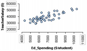
Scatter Plot A scatter plot allows you to explore the relationship between two numeric attributes with one displayed on the horizontal axis and the other on the vertical axis.
To make a scatter plot,
There are various ways in TinkerPlots to produce a line or curve of fit on a scatter plot. You can use the Drawing tool on the lower plot toolbar to draw a line (or curve) yourself. You can also change the scatter plot into a binned scatter plot and use averages to help see a trend. You can also use the Meter tool to create a smoothed line of fit. Several of these methods are demonstrated in the movie "Exploring Relationships 2." Often with scatter plots, two or more cases will lay exactly on top of one another because they have the same values for both attributes. There is currently no option for "jittering" cases so that you can see them or for creating special plotting symbols that stand for different numbers of cases. There are a few things you can do, however. To locate overlapping cases, you can pull an icon up and move it temporarily out of the way to see if there are any hidden cases. You can also create bins for one of the attributes. Finally, you can change the icon type to Fuse Rectangular, which will put cases that are close together or the same value into rectangles in which you can see each individual case.
|